Friday, December 7, 2012
Friday, November 2, 2012
Typography
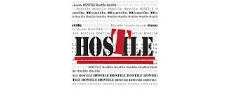
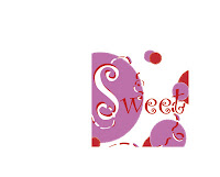 The words i chose for our typography project had to be opposites, so i chose Hostile and Sweet. My hostile piece has bold colors and fount and the word hostile is the boldest and looks mean. By using the colors red and black kinda make it look angry. On my word Sweet i used lighter colors like red white and light purple. The word is also flowing and kinda reminds me of candy by using the red and white like a candy cane. I guess because who i am and the colors i like the sweet piece was harder for me to like than the hostile, also the hostile piece was done pretty quickly. It took me almost a week to work on the word sweet. overall i liked this project and hope to do more similar to this one.
 Wednesday, October 24, 2012
INFOGRAPHICS
"COFFEE"
In this one it talks about the consumption of coffee. you have the captions compartmentalized by the coffee circles and you have little pictures to represent each fact and then the brown stands out from the white background and all the type face is the same font and is about the same color of brown and a lighter shades of brown."FUR"
This one is about how much fur is used each year. it has a dark background and has bright colors as the information that is supposed to stand out and draw our attention and the information is given kind of bulleted and chuncked. the typeface is all the same font, but some of the words are different colors and different sizes.Monday, October 15, 2012
Creative Brief
The
History of Sexuality
The original author of
the book, The History of sexuality, is Michel Foucault, but the client of the
book cover design is Vintage/Pantheon
Books. This company has been with AIGIA design for the past several
years and entering into many of their design competitions. They design and redesigning
books and book covers for authors and volumes. The purpose or some might say the goal for
this new series of book covers were to re illustrate an older series of books by
Michel Foucault. I guess the results of how well the cover does on the book,
the History of sexuality, will be measured on how many new copies of the book
will be sold, but for every book sold all of the profit will not all be profit
for the Vintage/Pantheon Books Company.
A
good target audience would be the young adults, it is meant to target interest
into the book because it is a simple one image not too much and not plain
either. The cover is simple colors of grayscale and a simple layout of rectangles.
The spring is the first they that draws
your attention then next you are drawn to the authors name then last you read
the title of the book which is to grab your attention and make you wonder even
more. The whole hierarchy of the cover is to draw the attention of the audience
and keep them interesting and looking into the book.
The
original publications was in 1974, but then was republished in 1984, and the
most resent publications was in New York City in 2010. My opinion is that comparing
to the other design covers this this the most intriguing and the one most
simple but not about a simple topic.
Wednesday, October 10, 2012
Movement, rhythm, and value modular.
For this project we used a photo as a reference and i used the edge of a water fountain that i have at home. The idea of this project was to employ movement and utilizes rhythm. The different layers of squares help show rhythm with thee layers getting larger further you go down, and the original fountain was wood. I used a texture to make some of the layers look like wood, but i did not do every layer like so because i felt it was overcrowded that way. The repetition of the corners of the squares line up and make there own line down the page, which also shows movement. The rocks at the bottom are in a small repetition, but hardly noticeable. The ribbon on the outer page i hope draws your attention closer to the main area of focus and shows movement.
Friday, September 28, 2012
Shape modules
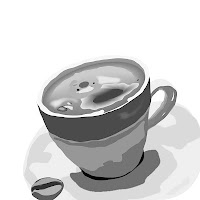 Organic shape; more detail and more natural they also have more of curvy lines and the shapes you see are natural they are simple but generic shapes. For the coffee that meant defining the cup and the handle and the plate and the coffee its self even the steam coming from the coffee.
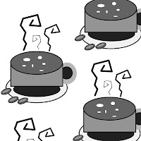 Geometric shapes; are what smart people see.. they are the basic shape everything is made out of if it is squares, circles, triangles or even lines. For my cup of coffee that meant there was lots of circles and ellipses for the coffee and the cup and the plates and the coffee bean, but for the steam it was difficult making it look like it was actually coming off the coffee and not standing on the coffee.

Ambiguous shapes; is the contrast between the actual shape and the space and shapes that surround the actual shape to make it what it is. the ambiguous shape i used was the steam.. there was the steam but the shapes and the contrast around the steam is what made the steam pop out.
Tuesday, September 18, 2012
Balance Modular
 Asymmetrical balance: the peace sign to the left has a large peace sign drawing your attention, but then there are 2 little peace signs that are placed in the top left corner that keeps the attention also and bringing the piece together are the zigzags going across the page. The gray scale of the peace signs also draw your attention to each of the peace signs differently.
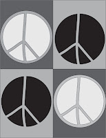 Symmetrical balance: peace signs to the left are even and set the same space apart on the page and the colors are balance. and the colors also are balanced on each square. All of the Squares correspond to each other.this one took some time to get the colors to contrast without blending into each other.
  Radial Balance: you see the center Peace sign but that is not the first thing that draws your attention. you look around and see the little peace sign and they start out really dark almost black along the edge of the page and lead you to the center by descending size and descending the shade in color from darker to a lighter shade till it reaches the center of the Peace and it is the largest peace sign which is the most important.
Wednesday, September 5, 2012
Intro to 2-D design
- First assignment was walking the campus of Maryville college. To find the unity between the buildings and finding what draws the most attention. I fond that all paths lead certain places like the library and the distance between all the buildings were similar. and what visual perspectives draw attention to us the quickest. which visual perspectives does the outside world view the most important? we found that we thought the Clayton centers stole the attention on campus, but the Anderson building is viewed by the public as most important. maybe because it is the oldest building?
- But off campus i used my work at food city and the stores idea is to draw the customers attention. The stores front is very big has big black windows and you walk in the store it is really bright and every sign is big and attention grabbing.
Subscribe to:
Comments (Atom)


