Color Vibrations

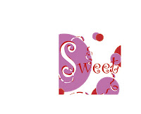
 The words i chose for our typography project had to be opposites, so i chose Hostile and Sweet. My hostile piece has bold colors and fount and the word hostile is the boldest and looks mean. By using the colors red and black kinda make it look angry. On my word Sweet i used lighter colors like red white and light purple. The word is also flowing and kinda reminds me of candy by using the red and white like a candy cane. I guess because who i am and the colors i like the sweet piece was harder for me to like than the hostile, also the hostile piece was done pretty quickly. It took me almost a week to work on the word sweet. overall i liked this project and hope to do more similar to this one.